
I’d like to share, in a summarized way, how I approach my work when tackling user problems.
In this summary, I’ll walk you through one of my latest projects at Jobandtalent.
Context: what is Jobandtalent?
Jobandtalent is essentially a marketplace for temporary workers: on one side, we have large clients that need temp workers on demand (Cabify, Amazon, Just Eat, Correos… across Europe and the Americas). On the other, we have an app where thousands of people can quickly find work.
We match big companies with the right candidates.
As part of the Workforce team, I work alongside a product manager, a team lead, a QA, five engineers, and a data scientist.
Our job is to build the part of the platform that clients use to manage their workforce:
- Request workers
- Extend worker contracts
- Request more workers
- Cancel contracts
- Manage absences
- Handle legal documentation
This kind of management is critical, especially because it involves very different types of clients (large, medium, small) operating in very different legal contexts (Spain, France, UK, Germany, Colombia, Mexico… where the regulations are, frankly, all over the place).
In this context, some internal teams reported that clients were struggling to access their documents—resulting in a rising number of support tickets.
The issue? Because of the legal complexity, client-worker relationships must be backed by lots of documentation: contracts, certificates, training records, even background checks. And the system wasn’t helping much.
Where do I start when something’s broken
Step one: talk to my PM (daily ritual).
We go through:
- Where this issue is coming from
- What we think is going on (hypotheses)
- What’s broken for users
- And what would count as success (aka: what are we trying to improve?)
From there, I jump into Notion or Jira to write a mini-definition. That’s how I structure my head—and share it with the team.
Design problem
The current “Documents” section was… let’s say, not doing great.
- Each country had a different experience. In Spain, it was all about CPDs (and nothing else). In other countries? A sad document table with zero usability.
- No search by worker
- No search by assignment
- Downloading took forever
- And worst of all: sometimes clients were redirected to the worker’s profile just to access documents—and if that worker had a lot of files, they had to scroll like maniacs to find what they needed.
Our hypothesis
If we fixed all that, and added what was really missing, we could:
- Make the experience consistent across countries
- Cut support tickets
- Boost adoption
Key Results
- Unify the information architecture
- Merge signing and management into one clean view
- Improve usability of core actions (search, download, etc.)
- Allow grouping by worker
- Redesign the documents section in worker detail view
- TL;DR: make it actually usable
Metrics we tracked
- 📈 Product adoption
- 📉 Weekly tickets related to documents (Kustomer)
- 📉 (Optional) Number of downloads
With that, I had a solid framework to begin. Next step: gather all the existing data we had.
What I do next: dig for gold
With that, I had a solid framework to begin. Next step: gather all the existing data we had.
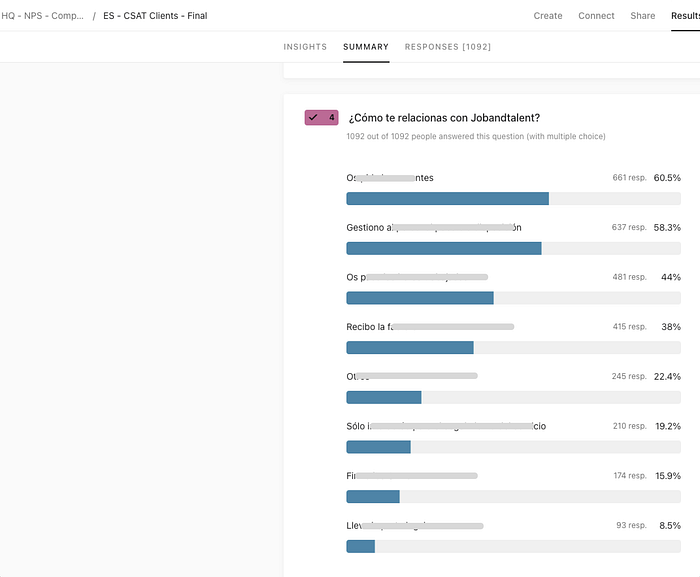
- In Spain, only N% (I’m hiding the actual data from the company, hope you understand 😌) of users reported [censored part].
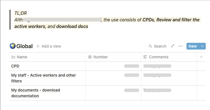
- Globally (mostly Spain), we saw that active users in Workforce heavily interacted with documents: CPDs and downloads.
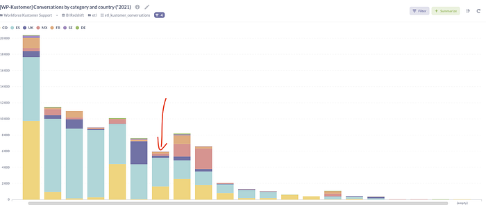
- Tickets related to documents (AF) as a percentage of total Kustomer tickets:
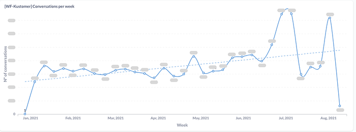
- Number of document-related tickets per week:
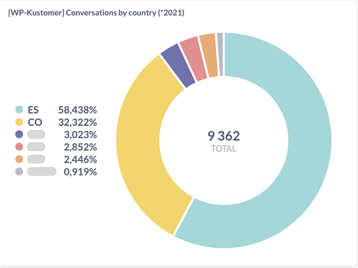
- Countries with the most tickets: Spain and Colombia
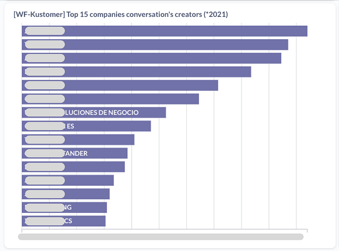
• Clients generating the most tickets:
All this was pulled using Metabase, with help from our data scientists.
After this step, I worked with another tool, Fullstory, where I could see exactly what was the user behavior in the product: clients managing documents.
Then I used Fullstory to see what users were actually doing inside the product.
Reviewing user sessions
To better understand user behavior around documents, we reviewed Fullstory sessions.
We built some funnels and a dashboard to get the big picture.
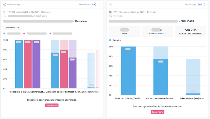
We also reviewed 15 full user sessions to understand actions, navigation patterns, and usability issues.
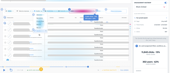
After this study, several problems have been detected that we will deal with from the user journey.
These quick studies are incredibly helpful. Watching real users is gold.
After this came user interviews.
User interviews
We spoke with several Service Managers from Spain and Colombia—since that’s where the problem had the biggest impact.
I’ll just share the interview questions here (the transcripts are in Spanish and contain confidential info).
TL;DR: the main reason clients need documents is for audits
Interview with [Name] (Service Manager) 🇪🇸
- Why does a customer need to download a document? What do they do with them?
- How, in general, is the process by which the client asks you to download the documents? What do you ask, what do you need? How is it managed by JT?Are they asking you to do something that, at the moment, is impossible to do now?
- Is there something that is especially problematic for you?
- What flow is there, why are they requested, how often are they requested
- Extra feedback
With all this information, it was time to move into UX work.
User journey studies
Based on everything we gathered, we mapped out the key user journeys.
To understand these, keep in mind:
- There are three main stages: Navigation, Document selection, and Download
- We flagged pain points (red post-its)
- We proposed quick solutions (green post-its)
Download documents from My staff: one by one
Download documents from My staff: in bulk
Download documents from Document
Venn diagram for our pain points
Our biggest challenges boiled down to:
- Usability
- Data visualization
Recap
We found many ways to improve how users download documents. The plan:
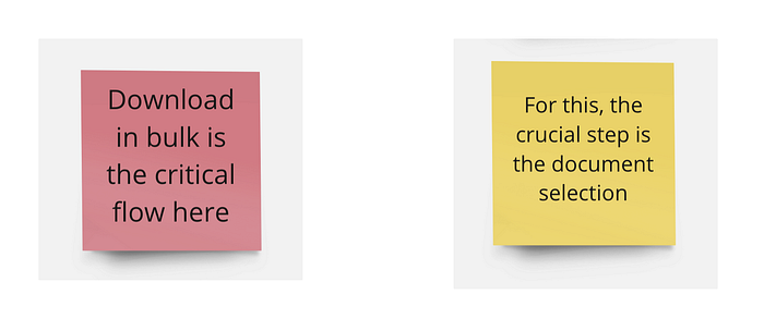
- Start with the bulk download flow (crucial for audits)
- Apply changes to the first two user journeys (My Staff). The Documents section will be next.
Defining tasks for these improvements
Time to break down and document every task based on the pain points and proposed solutions.
(Find the full document in Miro)
Understanding the situation better
Since there are lots of tasks related to My Staff, we grouped them to understand where we’re impacting the product.
We ended up with two main groups and two subgroups
The “task-oriented tool” angle came up as part of this work. It wasn’t the original focus, but the research surfaced new insights that will guide our next team goals.
Time for hi-fi prototypes and feedback!
I usually go straight to high-fidelity prototypes—since we work with a complete design system, it’s easier to build functional, UI-ready screens from the start.
This part—designing both UX and UI—is one of my favorite phases.
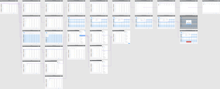
We created a prototype (can’t share it here 😢) with most of the proposed solutions. The goal was to validate it with:
- Backend & Frontend engineers
- Service managers (our users)
Annnnd feedback from testers
Name 1 (Service Manager) 🇪🇸
Much better! I think it will help with our client adoption. More “friendly”, what is what we need. One friend of mine who works for a client told me: “You have the best and most complete service! The only thing is that the product is difficult to understand…”, with this is much better.
The search by DNI is top, the search by comas would be amazing [we added that to the proto].
And please, remember to hide the irrelevant information for the client like “no show”, “never started” and so on.
Name 2 (Service Manager) 🇨🇴
I love the groups for documents. Maybe we need different groups depending on the countries. Here we’ll need a group called Seguridad Social.
In the WA detail, sometimes we don’t want to download any document, only to review it, so please make sure that is possible.
Could we upload documents to workforce? That would be awesome
I think that now is much much better. We’ll love to be able to make searches by cédula (DNI), using several ids at the same time separated by comas [added]
Name 3 (Service Manager) 🇪🇸
I like to see the documents groups. And I would love to filter by DNI. I love the new version in general!
Name 4 (Service Manager) 🇪🇸
Now it is much more intuitive! I love how you grouped the documents and the new button for Requested actions.
I see it easier for the clients, that is good, the clients must understand everything.
I would love to be able to filter by DNI, and search by several DNIs or names at the same times.
A few weeks after I left the company, the solution was finally shipped—and it worked like a charm.
Support tickets dropped, usage went up, and the team kept building on top of the new foundation.
I wasn’t around to see it live, but honestly, seeing the design and the thinking behind it come to life (even from the sidelines) was already a huge win.
Sometimes that’s the job: leave the place better than you found it and trust the team to take it from there.
V.