This is my story with FounderNest.
It wasn’t easy—far from it—but it’s hands down one of the things I’m proudest of as a product designer.
Bit by bit, as we hit business goals, I turned the whole experience around. What started as a patchwork became a real product.
What the heck is FounderNest?
FounderNest is a market‑intelligence platform harnessing AI for corporate innovation and scouting teams.
It helps big companies—including the likes of Roche, Kyocera, Novo Nordisk, Telefónica, and MAPFRE—discover, track, and assess startups and emerging tech at scale.
Think scouting without spreadsheets, but smarter, faster, and global.
What I found when I walked in (spoiler: it looked like puzzle pieces dropped from the cookie jar)
When I joined, I was the only in-house designer.
The product had zero sense of flow. Tons of features, but no structure:
- You couldn’t build or edit a prompt in a natural way.
- No unified search—you couldn’t simply find a company from any screen.
- No table view or detail view per company, so scanning was a nightmare.
- Bulk actions? A unicorn. You couldn’t apply actions across companies at scale.
Here are a few examples of what the product looked like when I first joined:
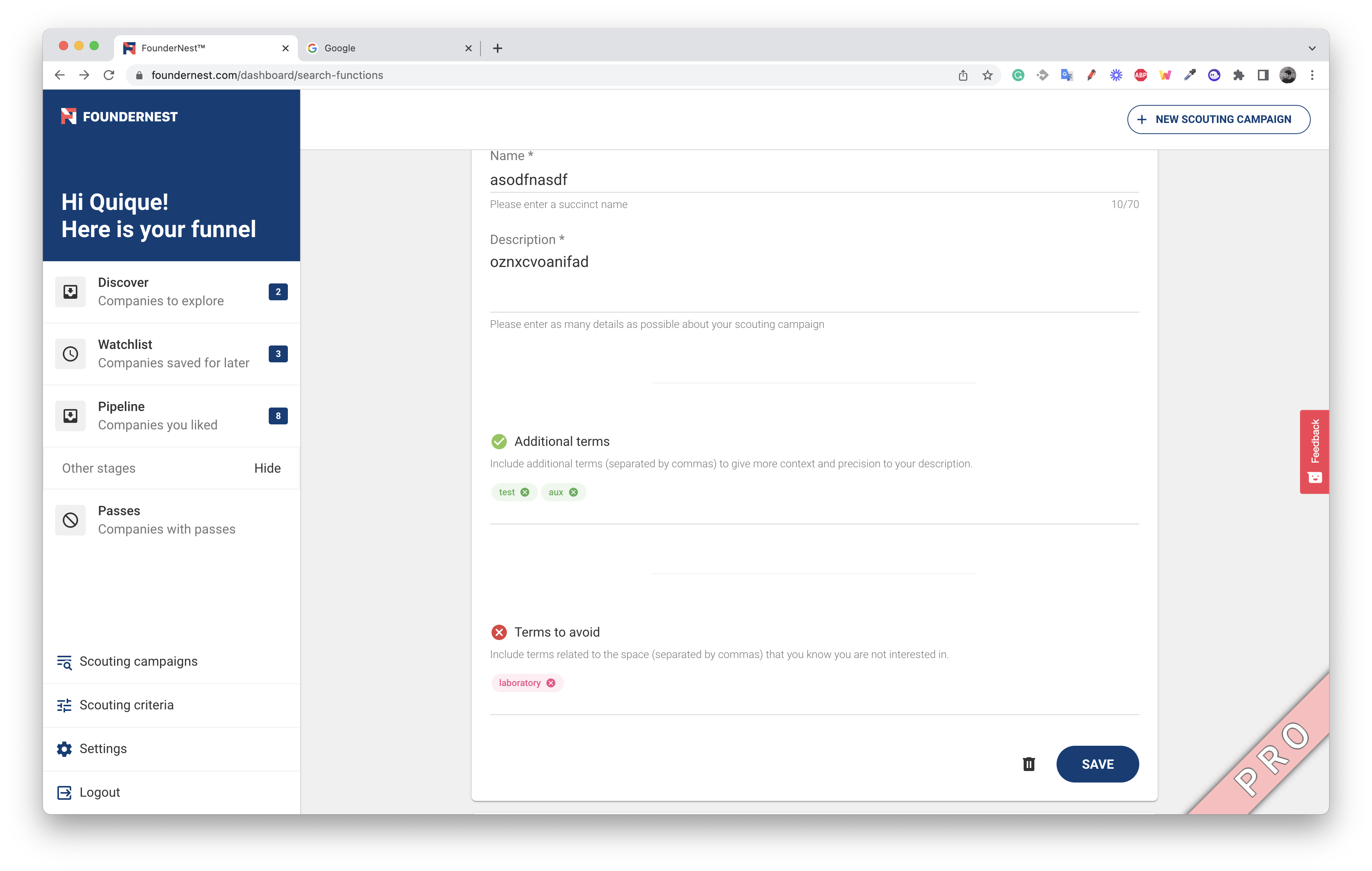
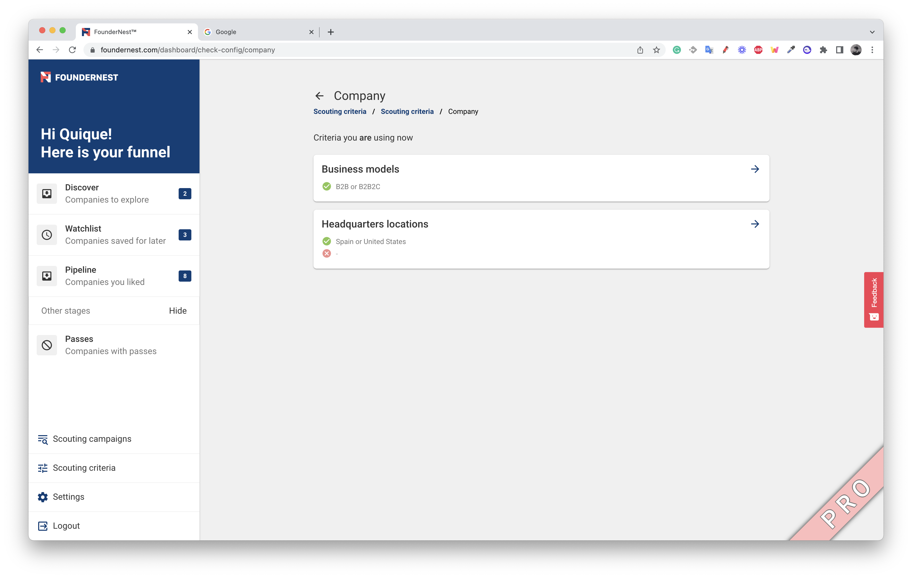
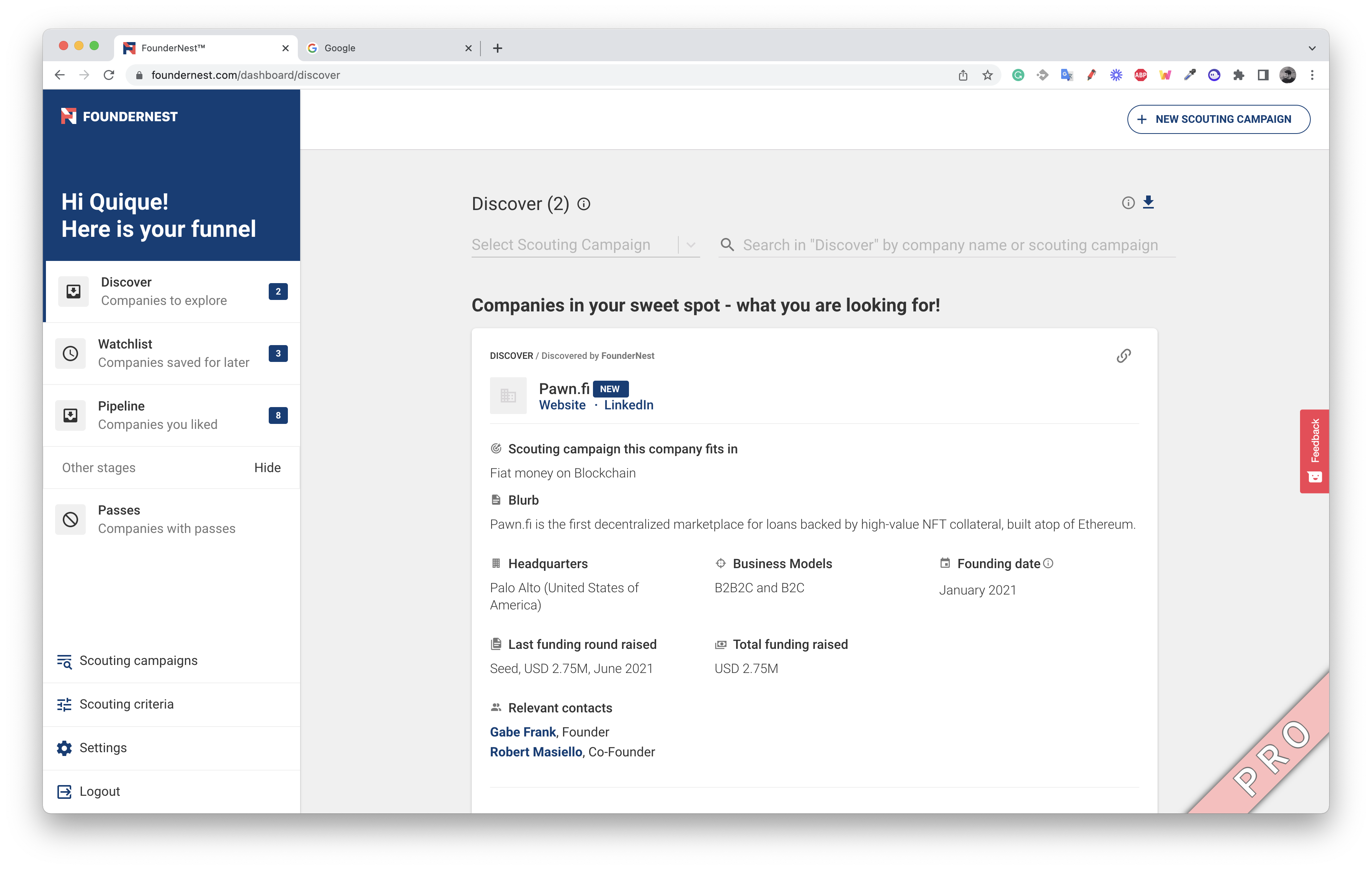
The result?
The Customer Success and Sales teams were operating in hero mode—running calls daily just to explain the product.
It wasn’t intuitive—it didn’t work as a product should.
Fixing the foundations while the train stayed in motion
The team—founders, PMs, engineers—always pushed for rapid impact on OKRs: activation, retention, recurrence.
No time for big refactors.
But every time I touched a task, I asked: What’s the foundation that will make this scale in the long run?
I sketched upstream workflows: prompt editing, searching, results viewing, quick actions.
I evangelized the idea of building a single product that could flex into any use case.
I used an analogy:
“You can build a 12‑story building and turn it into offices, apartments, or a hospital—but only if the foundation is solid. If not, you can never scale fast.”
And foundations?
They don’t come from users pointing at features—they come from design vision.
Changes that actually moved the needle
These were the game‑changers:
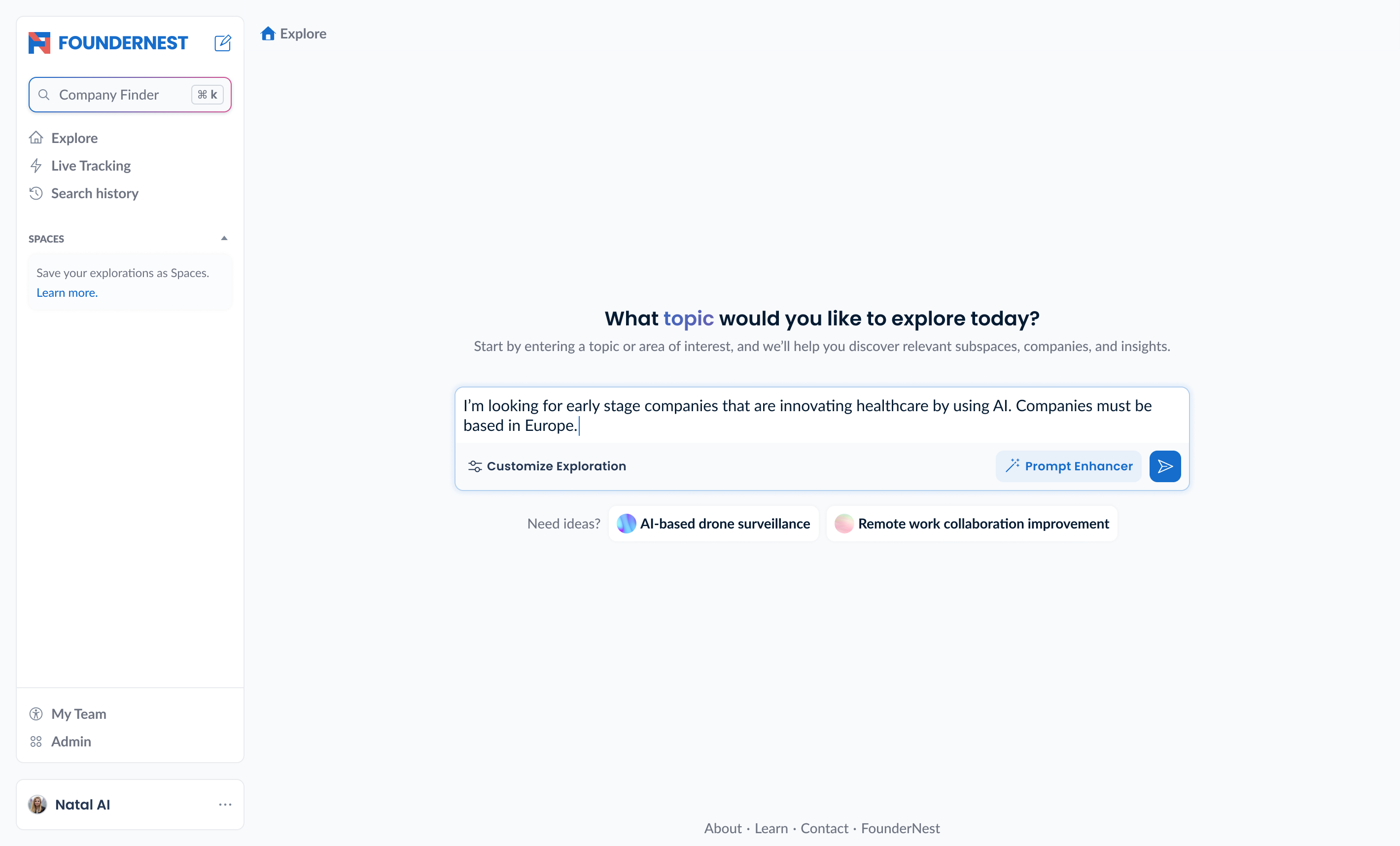
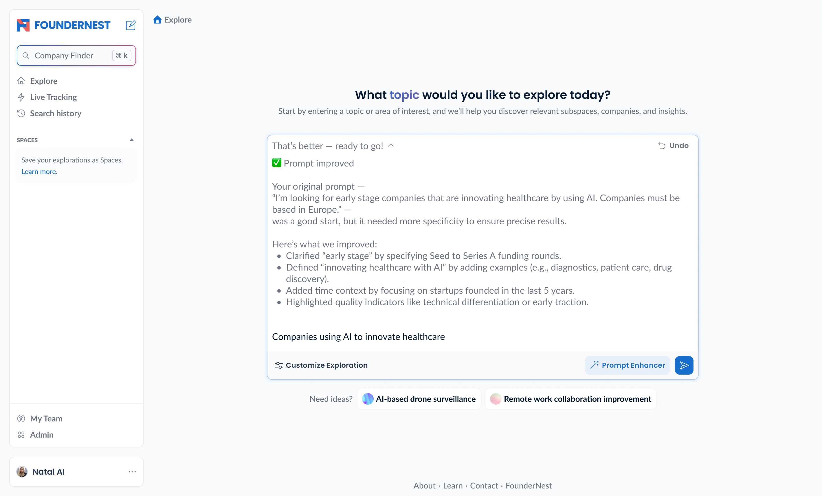
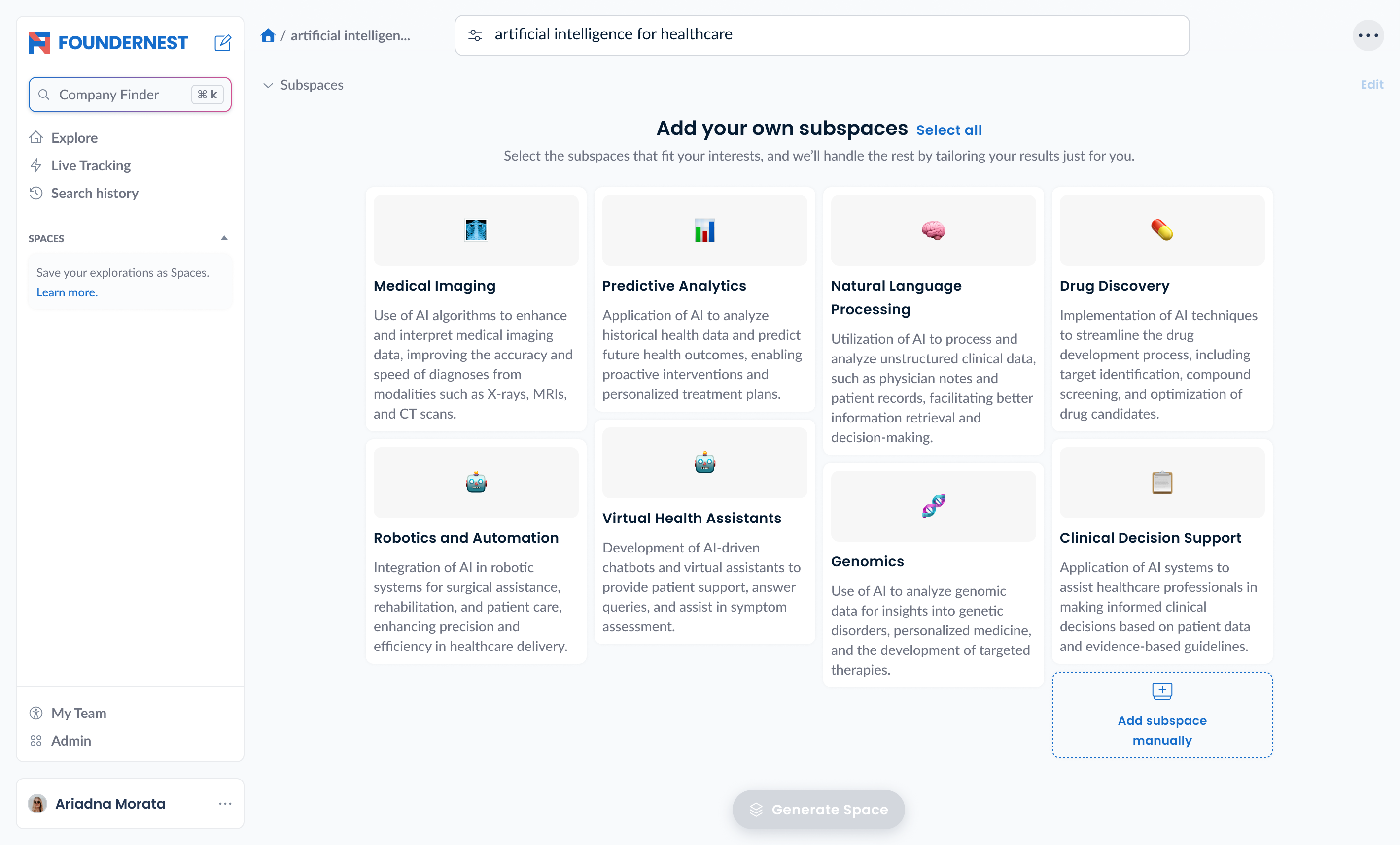
- Built prompt creation/edit flows instead of dumping filters into screens.
- Separated prompt and advanced filters clearly.
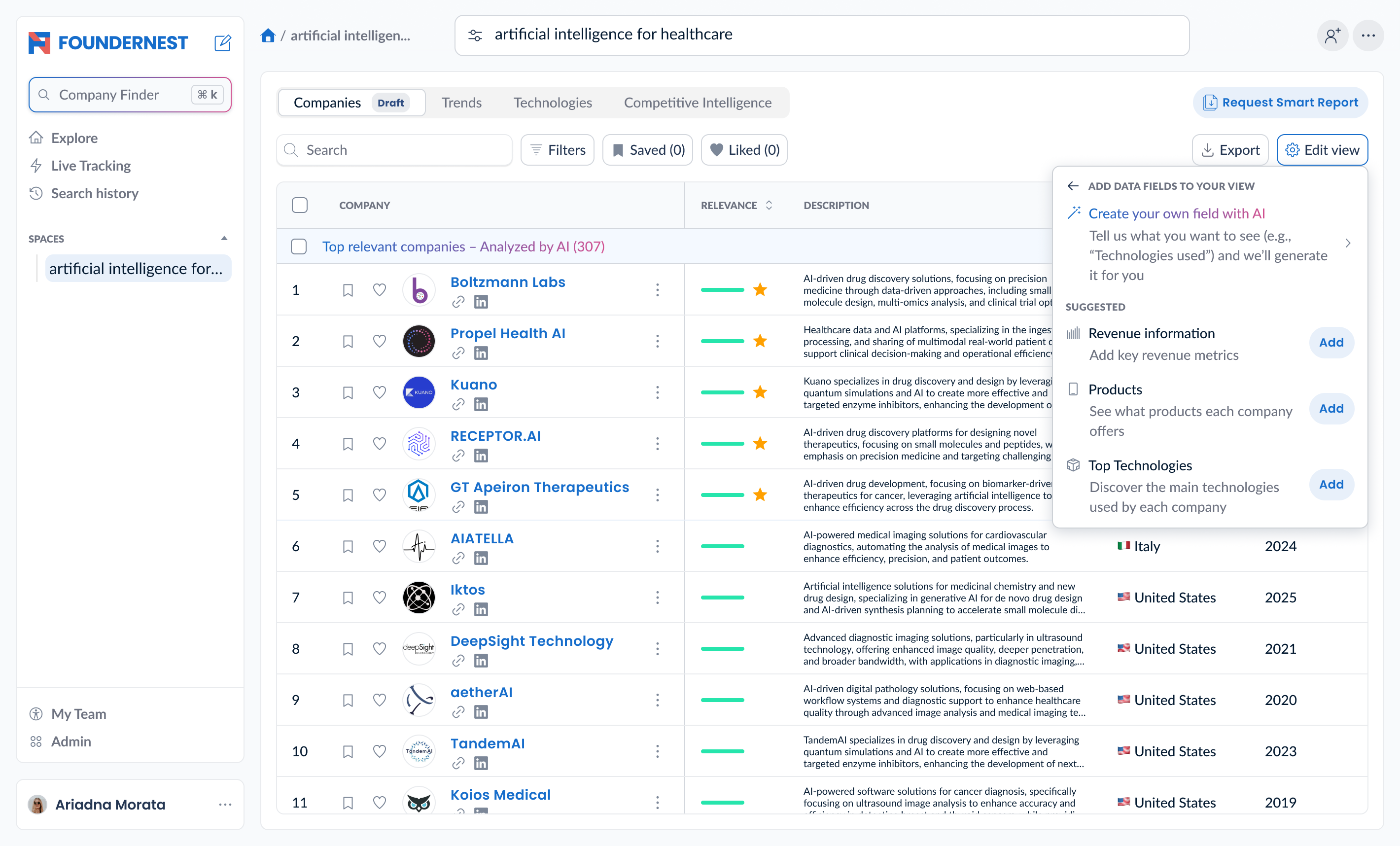
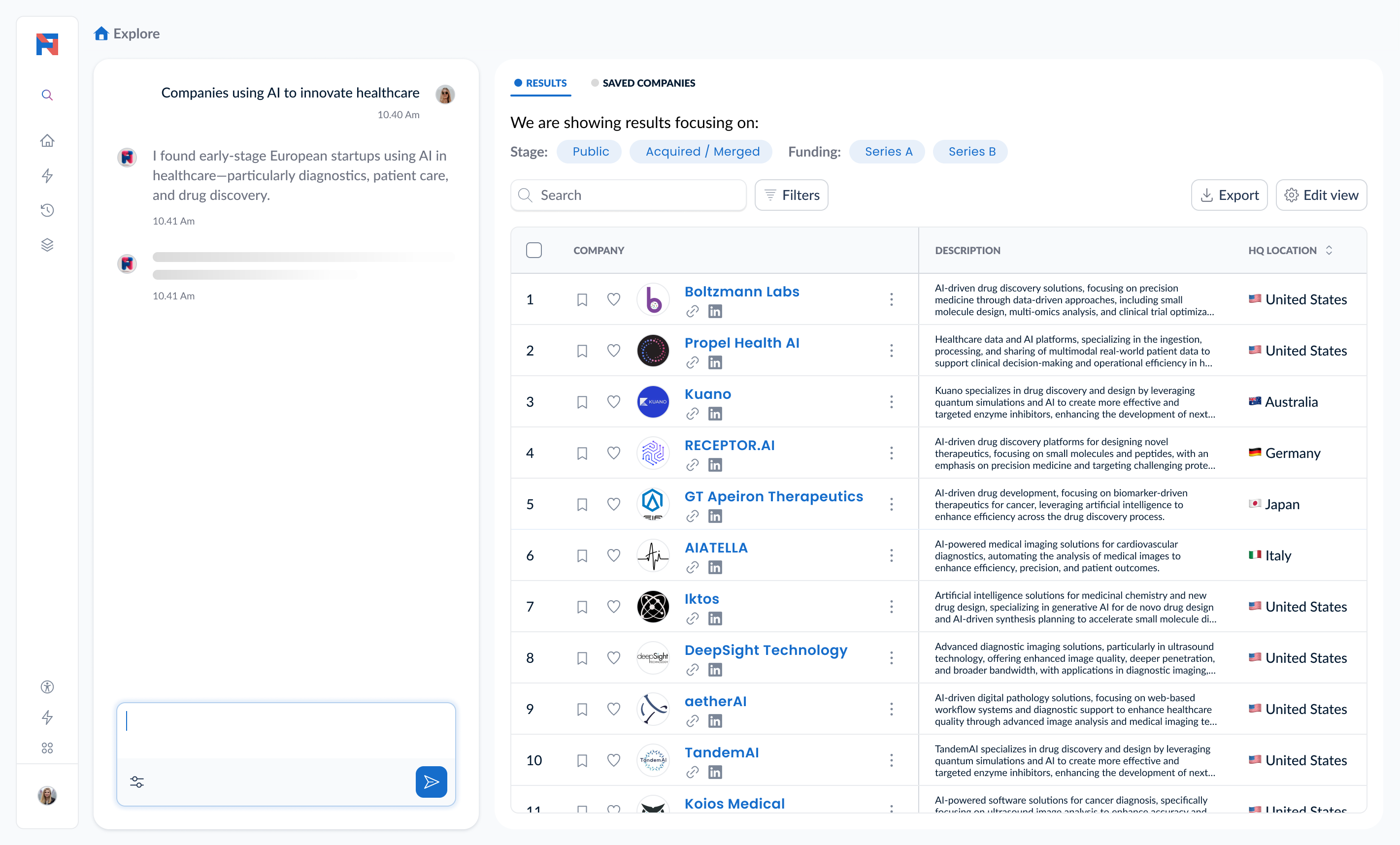
- Added a table view for scanability.
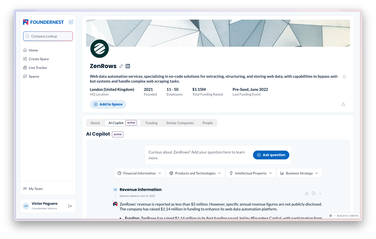
- Created scalable company detail panels above the fold.
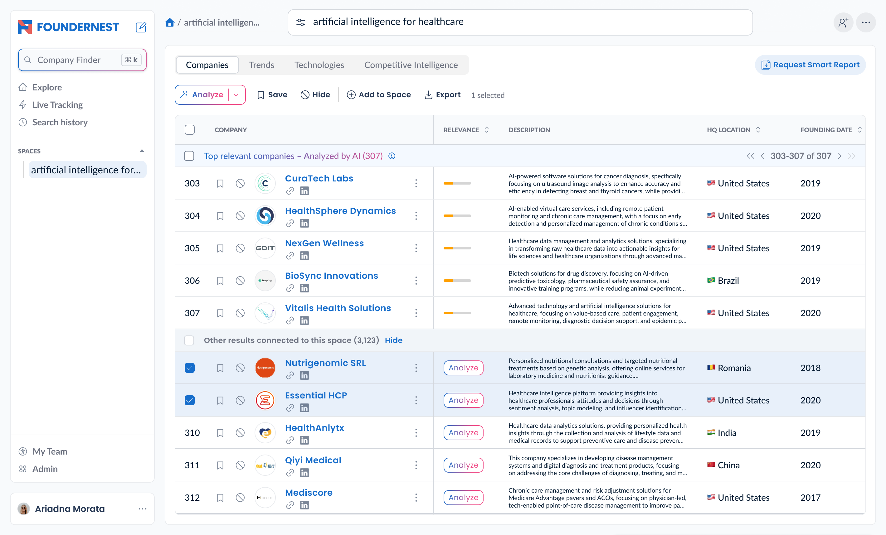
- Introduced bulk actions—finally meta.
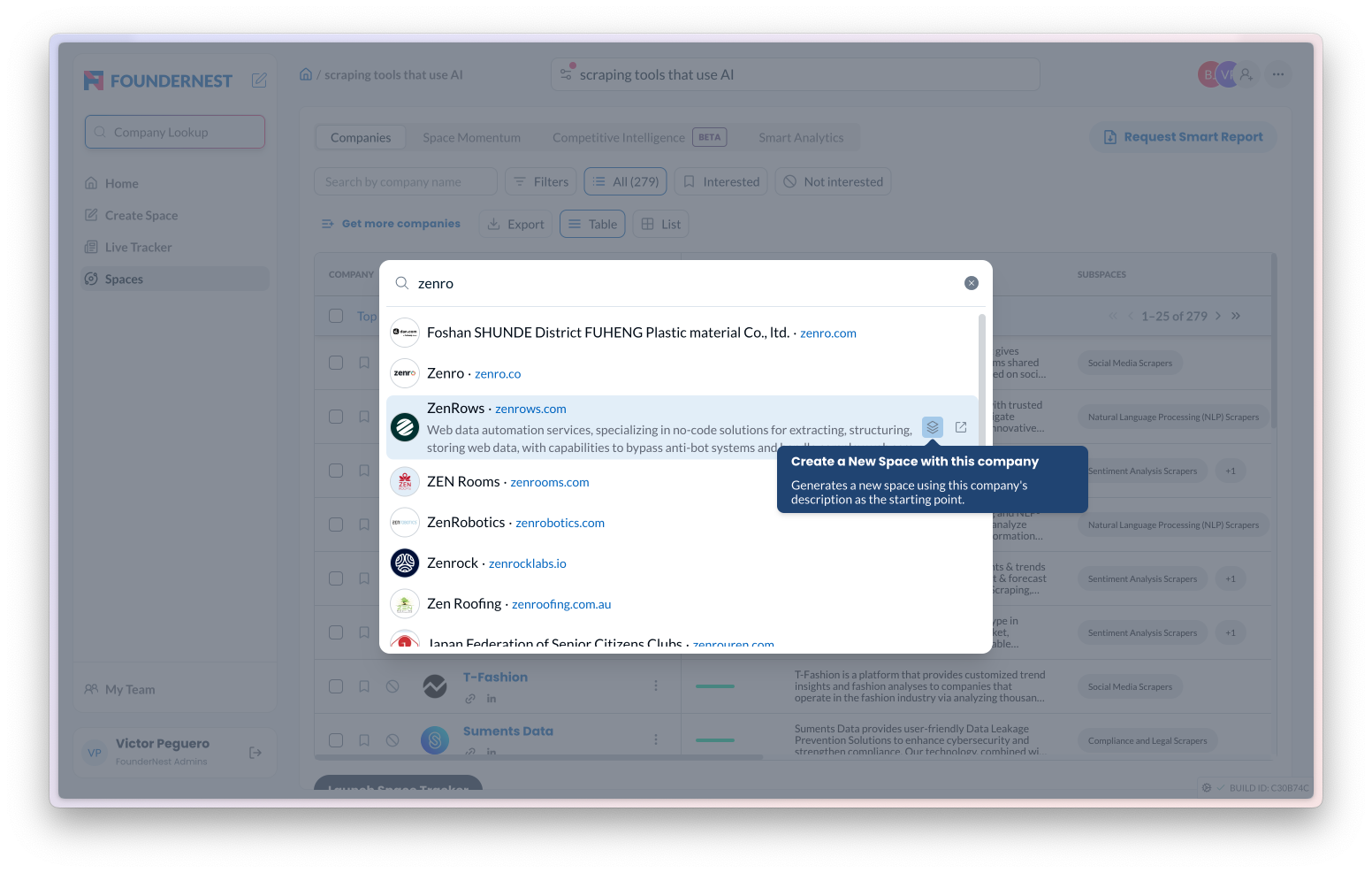
- Added a global company search available everywhere.
All to support exploratory, non‑linear workflows, the way scouts actually work.
Not clicks for the sake of clicks—just clarity and flow.
From Frankenstein to future-proofed product
After about two years of consistent effort:
- Creation of “spaces” skyrocketed—we removed friction from prompt building.
- User recurrence climbed, thanks to instant search across companies.
- Bulk‑action engagement became off the charts.
- Product velocity for new initiatives accelerated—because we weren’t rebuilding the UI every time.
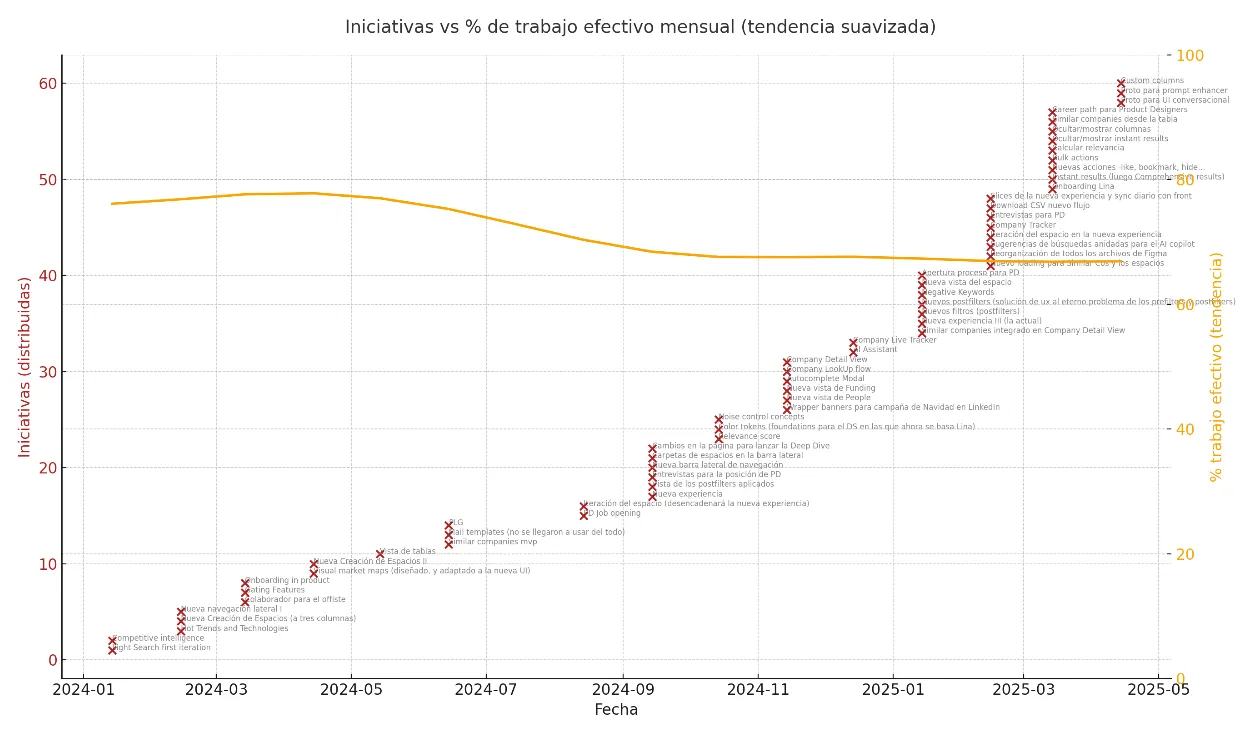
We even tracked the number of design-driven initiatives: from sluggish to sprint-like, thanks to strong foundations.
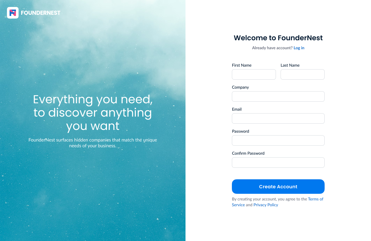
These are some of the current designs. If something’s not clear, just ask—but honestly, it already feels way easier to understand what’s going on, even without much context:
What I learned building complex SaaS with AI and data
- Short-term speed kills long-term velocity. Quick hack = long‑term debt.
- Foundations can’t be user-directed—they’re invisible but essential.
- UX in AI/data SaaS means: abstraction without confusion, power without overwhelm.
- I wrote it up in detail in this article → This is what I’ve learned from all my years designing SaaS products
Simple: never sacrifice usability patterns for short-term gain.
That “fast” feels fast in the moment—but it’s a speed trap when you need to iterate or scale two months in.
Product foundation isn’t sexy—but it’s what lets you build 12 stories without collapse.
That’s the story of FounderNest’s product transformation—starting from chaos and ending up with a database-driven tool that actually behaves like a product.
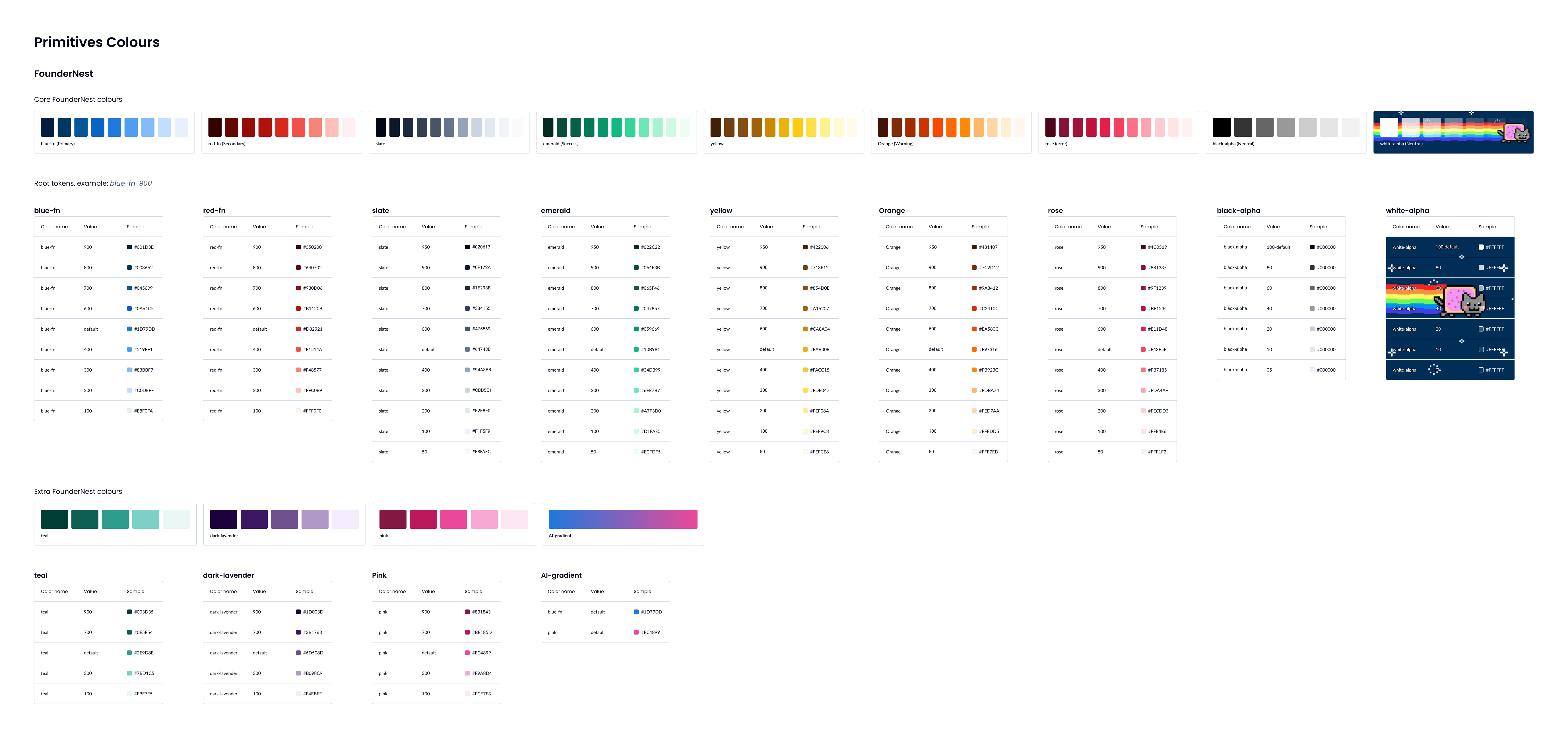
By the way, here’s the color token system I built for FounderNest.
Totally unrelated to the rest of the story, but hey, it deserved a place somewhere.
Thanks for reading :))
V.